
2020 Color Trends
- Aly Thompson

- Jan 1, 2020
- 3 min read
THE 5 SHERWIN-WILLIAMS COLOR PALETTES & 45 COLOR TRENDS FOR 2020
ALIVE PALETTE
Our Alive Palette is influenced by Optimism, authenticity & the New Local. This palette has a very open and inviting sense of color. Its neutrals are curated in a way that suits a variety of different tonalities ranging from cool to warm.

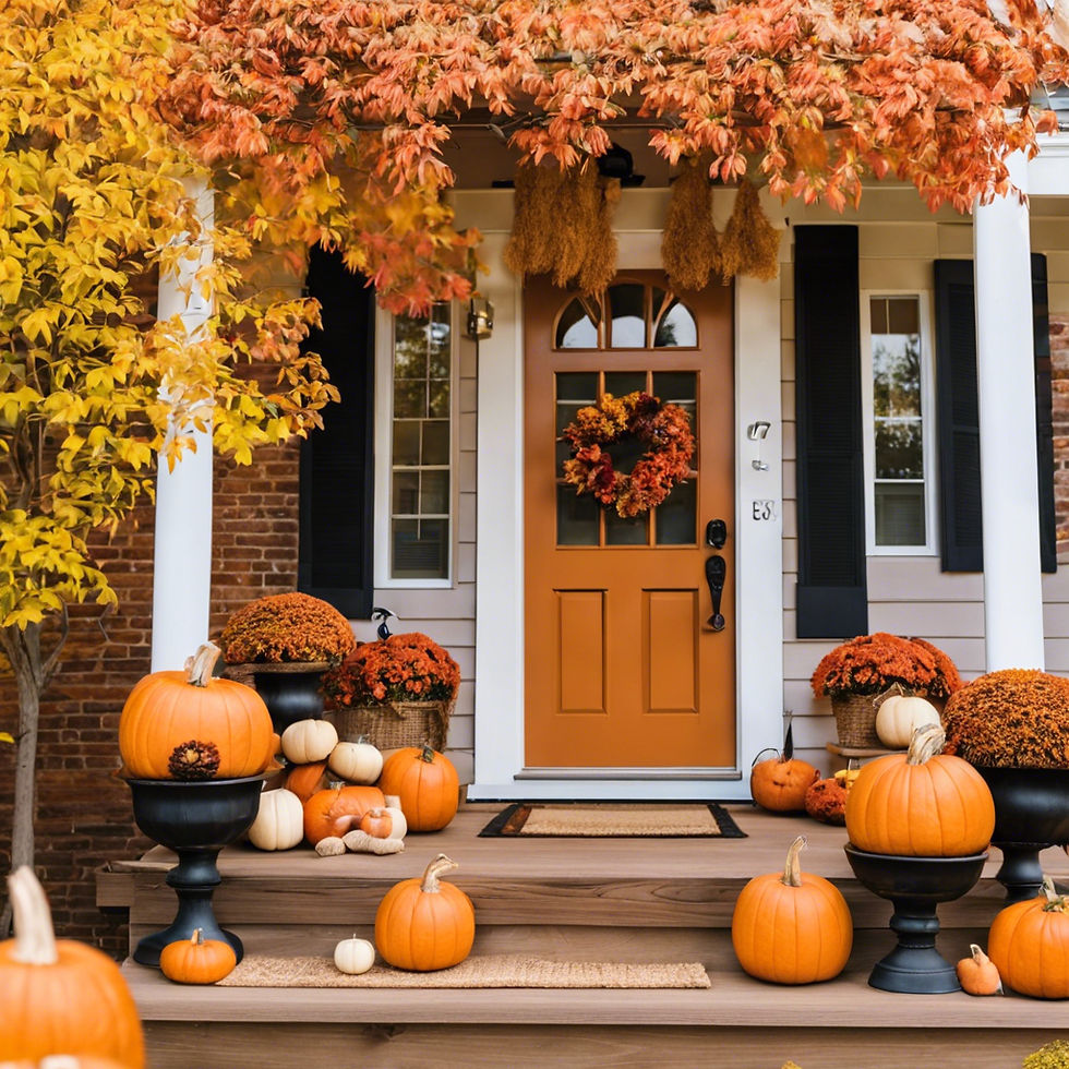
These colors have a very global feeling and are very rich in nature, from SW 6209 Ripe Olive (217-C7) - a deep viridian green - to contrasting SW6369 (128-C5 ) Tassel - a beautiful orange gold. In a sense, these colors are very traditional....greens and blues mixed together.
The thing that’s different about the Alive palette is the addition of the warm undertone colors which heighten the passion of the navy and deep olive when seen together.

MANTRA PALETTE
Mantra is our most subdued palette, but in no way should this ultra-light palette be taken lightly! It’s influences are minimalism, serenity, scandinese & sanctuary. This palette is all about balance.

Mantra creates a push/push effect with Nordic simplicity and the order and elegance of Japanese aesthetic. It’s filled with beautifully toned neutrals, which slide seamlessly from warm to cool undertones. I think the most impressive part of this palette is the addition of SW 7074 Software (235-C5) .
When seen by itself, Software is a bold choice in its depth of color, but when paired with SW6232 Misty (222-C1) and Spatial White SW6259 (273-C6) it seems to dim the color and almost brings it to a more neutral ground. This palette to me, represents visual serenity.

PLAY PALETTE
Play is our third and most daring palette – its influences are Escapism, Humor, Joy and Energy.

This palette represents the bold in design. it’s for those who truly want a space that is representative of their true being, their playful nature and expect to shock and awe their guests.
On the other hand, this palette is also very versatile. Within all of these palettes, we’re not always suggesting to use ALL of the colors as wall paint, we know you’re not trying to create a circus in our space. Sometimes the pops of color can be seen in your artwork, the fabric on your new couches or even the fresh flowers you bring in from the garden. It’s all about personality in this palette. Every color in this set is unique, when paired together or seen separately. Some say that white is a color, but for me it’s an absence of color which allows us to create this shocking backdrop to these wild but tamed colors!

HAVEN PALETTE
Haven’s influences are simplicity, Wabi-Sabi, Conservation and material health. This palette is the representation of “home” We’ve selected colors that draw you in and encourage you to be inspired by seasonal changes. Rich and subtle shades of sea, sand, forest and sky. These calming tones of blues, greens, yellows and pinks flow effortlessly in this palette.

The concept of wabi-sabi, or the art and love of the imperfect as its known is being embraced by most these days. Wabi-sabi helps us realize the need to carve time out of our busy schedules for mindfulness and contemplation and to keep the idea of spatial and material health in the forefront.
One of the biggest concepts in Haven’s designs is the idea of conservation. As we move forward we need to ensure our designs reflect the protection of our planet. As we strive to make things more beautiful, we want to ensure we’re not creating destruction in our wake, this palette is a visual reminder to be aware!

HEART PALETTE
Our last and most harmonized palette is called Heart. This palette is influenced by Bauhaus, Bohemian, Fusion and Humanity. We called this palette heart because of its connection to a variety of genres and emotions. It’s a unique fusion of iconic modern design mixed with an intergenerational boho vibe.

This mediation on comfort, connection and pleasures of everyday stem from a place of balance. By utilizing similar undertones, this palette screams soft yet refined. These interconnected tones will suit almost any color set. By using a monochromatic color palette, you can harmonize almost any space. With the addition of SW9005 Coral Clay (114-C4) it adds a fun color dynamic of the unexpected.

Im swooning over every color palette and trying to find a millions ways to use all of these in my house... any one else?! Which palette is your favorite? Tell me in the comment section!!
Resources:
https://www.sherwinwilliams.com


Comments